
Want to build a cool widget in flutter? This blog contains how I had developed an arrow pad.
Arrow Pad
Arrow Pad? What is it? Well, it's just a pad containing arrow's and responds to the inputs we give. The first thing which comes to mind is the arrow keys in a computer. Isn't it? But that is not what inspired me and instead is mp3 players.
Compouter Arrow Keys on Keyboard Image Source
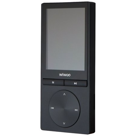
Wiwoo H9 mp3 player Image Source
Designing
Designing? I guess not. The design is absolute looking at the mp3 players. Now, Let's not waste time and dive into the code.
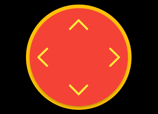
Linking an image of how I thought it should be (and how it will be).
Final design on how it looks
Code
I would want to call this ArrowPad. So, let's start by creating the class.
// arrow_pad.dart
import 'package:flutter/material.dart';
class ArrowPad extends StatelessWidget {
  const ArrowPad({ Key? key }) : super(key: key);

  @override
  Widget build(BuildContext context) {
    return Container(
      // TODO: build arrow pad
    );
  }
}
I would first take input on the height and width of the widget. Using these, we can be sure that the widget builds as intended.
// arrow_pad.dart
import 'dart:math';
import 'package:flutter/material.dart';

class ArrowPad extends StatelessWidget {
  const ArrowPad({
    Key? key,
    required this.height,
    required this.width,
  }) : super(key: key);

  @override
  Widget build(BuildContext context) {
    // size of the widget
    double _padSize = min(height, width);
    return Container(
      height: height,
      width: width,
      color: Colors.transparent, // we don't want container to be visible
      // to make sure the widget is in the center
      child: Center(
          // TODO: add child
      ),
    );
  }
}
Now that the base code is done, let's start with outer circle. We can use a container with a color and circle shape.
Container(
    decoration: BoxDecoration(
        color: Colors.yellow, // let's put some color for now
        shape: BoxShape.circle,
    ),
    height: _padSize,
    width: _padSize,
    // add child
),
Going next, let's add the inner circle. I want to show a small elevation as to have a button feel. So, I will be using a card.
// we don't want to miss the padding
Padding(
    padding: const EdgeInsets.all(5.0),
    child: Center(
        // material is used so to have a ripple effect when pressed later
        child: Material(
        color: Colors.transparent,
        child: Card(
            elevation: 5,
            shape: RoundedRectangleBorder(
                borderRadius: BorderRadius.circular(_padSize),
                ),
            ),
            // add child
        ),
    ),
),
Now moving on, we just need to add the icons with ripple effect. I will go with Cupertino icons as they look good for the pad.
import 'package:flutter/cupertino.dart';
// inkwell for ripple effect
InkWell(
    borderRadius: BorderRadius.circular(_padSize - 10),
    onTap: () {},
    child: Column(
        // fill the space
        mainAxisSize: MainAxisSize.max,
        // space around to equally balance the children
        mainAxisAlignment: MainAxisAlignment.spaceAround,
        children: [
        Icon(
            CupertinoIcons.chevron_up,
            size: _padSize / 4,
        ),
        // row is for left and right
        Row(
            // fill the space
            mainAxisSize: MainAxisSize.max,
            // keep a gap in between
            mainAxisAlignment: MainAxisAlignment.spaceBetween,
            children: [
            Icon(
                CupertinoIcons.chevron_left,
                size: _padSize / 4,
            ),
            Icon(
                CupertinoIcons.chevron_right,
                size: _padSize / 4,
            ),
            ],
        ),
        Icon(
            CupertinoIcons.chevron_down,
            size: _padSize / 4,
        ),
        ],
    ),
),
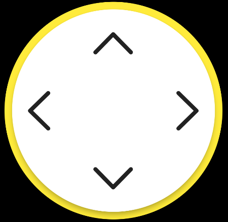
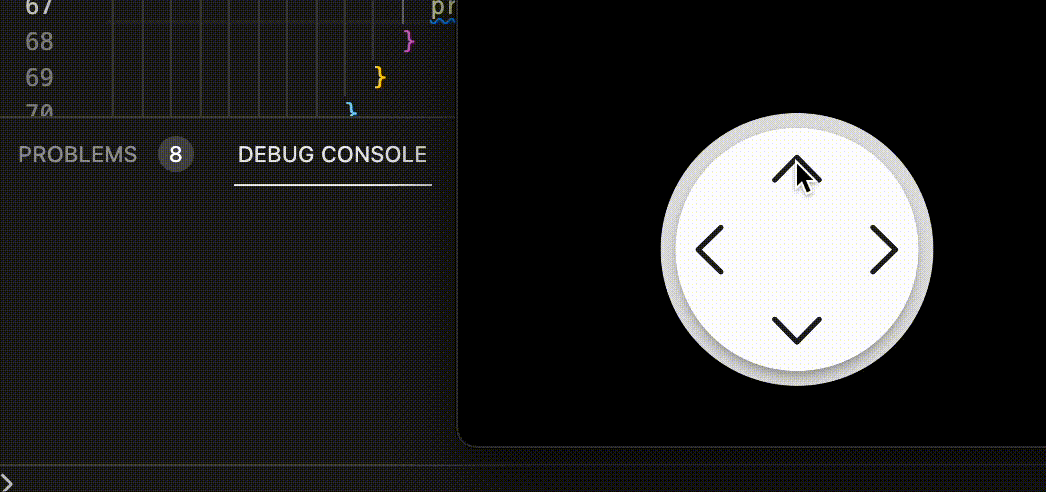
After putting up all the widgets into their place. Let's look at how the widget is now.
Final build after putting up widgets together
Handle Click
Till here, the building was smooth. But, the widget is not complete without its response when the key is pressed. You'd think why I didn't use the IconButton. IconButton has its material style and will override the ripple effect we want.
But, instead we have a InkWell property which has onTapDown. It provides us the user tap location. We can use it to achieve our goal to determine where the user has clicked.
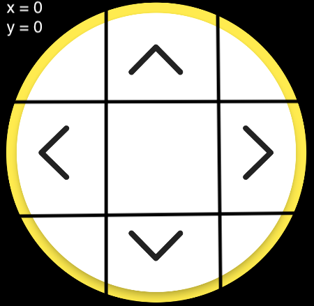
Widget partitions
I divided the widget into 9 equal parts. By looking at the image, there are only 4 parts which we need to look at to call the feedback.
Top Arrow: Top Middle
Left Arrow: Left Middle
Right Arrow: Right Middle
Down Arrow: Down Middle
taking the calculations of x position and y position. The final method looks like
onTapDown: (details) {
    double x = details.localPosition.dx;
    double y = details.localPosition.dy;
    double part = (_padSize - 20) / 3;
    if (x > part && x < part * 2) {
    // up or down
    if (y < part) {
        print('up');
    } else if (y > part * 2) {
        print('down');
    }
    } else if (y > part && y < part * 2) {
    // left or right
    if (x < part) {
        print('left');
    } else if (x > part * 2) {
        print('right');
    }
    }
},
This method completes our widget. which can work even with feedback. Below is how it works
Working Demo of the widget
Final Touch-up
Now, putting all pieces to together with some added toppings. The whole widget looks like this.
// arrow-pad.dart
import 'dart:math';
import 'package:flutter/cupertino.dart';
import 'package:flutter/material.dart';

class ArrowPad extends StatelessWidget {
  const ArrowPad({
    Key? key,
    required this.height,
    required this.width,
    this.tapUp,
    this.tapDown,
    this.tapLeft,
    this.tapRight,
    this.outerColor = const Color(0xFFE0E0E0),
    this.innerColor,
    this.iconColor,
  }) : super(key: key);

  final double height;
  final double width;
  final void Function()? tapUp;
  final void Function()? tapDown;
  final void Function()? tapRight;
  final void Function()? tapLeft;
  final Color? outerColor;
  final Color? innerColor;
  final Color? iconColor;

  @override
  Widget build(BuildContext context) {
    double _padSize = min(height, width);
    return Container(
      height: height,
      width: width,
      color: Colors.transparent,
      child: Center(
        child: Container(
          decoration: BoxDecoration(
            color: outerColor,
            shape: BoxShape.circle,
          ),
          height: _padSize,
          width: _padSize,
          child: Padding(
            padding: const EdgeInsets.all(5.0),
            child: Center(
              child: Material(
                color: Colors.transparent,
                child: Card(
                  color: innerColor,
                  elevation: 5,
                  shape: RoundedRectangleBorder(
                    borderRadius: BorderRadius.circular(_padSize),
                  ),
                  child: InkWell(
                    borderRadius: BorderRadius.circular(_padSize - 10),
                    onTap: () {},
                    onTapDown: (details) {
                      double x = details.localPosition.dx;
                      double y = details.localPosition.dy;
                      double part = (_padSize - 20) / 3;
                      if (x > part && x < part * 2) {
                        // up or down
                        if (y < part) {
                          tapUp!();
                        } else if (y > part * 2) {
                          tapDown!();
                        }
                      } else if (y > part && y < part * 2) {
                        // left or right
                        if (x < part) {
                          tapLeft!();
                        } else if (x > part * 2) {
                          tapRight!();
                        }
                      }
                    },
                    child: Column(
                      mainAxisSize: MainAxisSize.max,
                      mainAxisAlignment: MainAxisAlignment.spaceAround,
                      children: [
                        Icon(
                          CupertinoIcons.chevron_up,
                          size: _padSize / 4,
                          color: iconColor,
                        ),
                        Row(
                          mainAxisSize: MainAxisSize.max,
                          mainAxisAlignment: MainAxisAlignment.spaceBetween,
                          children: [
                            Icon(
                              CupertinoIcons.chevron_left,
                              size: _padSize / 4,
                              color: iconColor,
                            ),
                            Icon(
                              CupertinoIcons.chevron_right,
                              size: _padSize / 4,
                              color: iconColor,
                            ),
                          ],
                        ),
                        Icon(
                          CupertinoIcons.chevron_down,
                          size: _padSize / 4,
                          color: iconColor,
                        ),
                      ],
                    ),
                  ),
                ),
              ),
            ),
          ),
        ),
      ),
    );
  }
}
and it can be used using ArrowPad. I know my color scheme is bad. Everything depends on how you use it.
ArrowPad(
    height: height / 3 - 30,
    width: 2 * width / 3,
    tapUp: () => print('up'),
    tapDown: () => print('down'),
    tapLeft: () => print('left'),
    tapRight: () => print('right'),
    iconColor: Colors.yellow,
    innerColor: Colors.red,
    outerColor: Colors.yellow,
),
The widget now looks complete with proper standards and has the usage similar to actual widgets.
Hope you have learnt something from this (not just copy paste)
Happy Fluttering!!